Posts

Using TabLayout and ViewPager with CollapsingToolbarLayout

Image
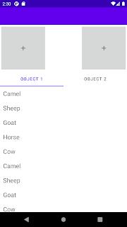
Using android TabLayout and new viewpager2 you can make your fragment layout inside tab layout to make them have expand collapse. To make the top layout collapse you have to use CollapsingToolbarLayout with combination of other layouts and properties. Below is the example where we use TabLayout , ViewPager2 with FragmentStateAdapter to host fragments. Main Activity Layout which host CollapsingToolbarLayout , TabLayout , ViewPager2 you can have this inside fragment also so viewpager can host other fragments. activity_tab_layout.xml <? xml version ="1.0" encoding ="utf-8" ?> <androidx.coordinatorlayout.widget.CoordinatorLayout xmlns: android ="http://schemas.android.com/apk/res/android" xmlns: app ="http://schemas.android.com/apk/res-auto" xmlns: tools ="http://schemas.android.com/tools" android :layout_width ="match_parent" android :layout_height ="match_parent" android :fitsSystemWind

Using Extended Floating Action Button

Image
You may have seen gmail app where fab button expand and collapse as you scroll. fab button has been already there for some time new api extended dab button was added some time back. to use extended fab button you need to use  com.google.android.material.floatingactionbutton.ExtendedFloatingActionButton simplest implementation looks like below : <com.google.android.material.floatingactionbutton.ExtendedFloatingActionButton android:id="@+id/floating_action_button" android:layout_width="wrap_content" android:layout_height="wrap_content" android:layout_margin="16dp" android:layout_marginEnd="24dp" android:layout_marginBottom="24dp" android:contentDescription="fab button" android:text="Add Button" app:layout_constraintBottom_toBottomOf="parent" app:layout_constraintEnd_toEndOf="parent" app:icon="@drawable/ic_baseline_add_24" /> No

Styling android button

If you want to style android button with custom style with background, custom font different enable disable state button colors you can do that using providing custom style to your button below is the example: inside res/value folder 1st. style for the button  <style name =“CustomButtonStyle” parent ="Widget.AppCompat.Button" >     <item name ="android:background" > @drawable/button_background.xml </item>     <item name ="android:textSize" > 16sp </item>     <item name ="android:textColor" > @color/black </item>     <item name ="android:fontFamily" > @font/font_name </item>     <item name ="fontFamily" > @font/font_name </item>     <item name ="textAllCaps" > false </item> </style> 2nd. in background we are supplying selector so we can have different enable / disable state background and text colors button_background.xml <? xml ver

Retry API on fail using rxjava retryWhen android

If you have requirement where you want to retry api you can take advantage rxjava retryWhen operator with below function. here with use of custom function you can add logic to check http status when you want api to retry and max number of time you want api to be retried.                public class RetryWithDelay implements Function < Observable <? extends Throwable >, Observable <?>> { private long delay ; private final int max = 2 ; private int count ; public RetryWithDelayPresenter ( final long delay ) { delay = delay ; count = 0 ; } @Override public Observable <?> apply ( Observable <? extends Throwable > observable ) { return observable . flatMap ( throwable -> { if ( throwable instanceof RetrofitException ) { final RetrofitException error = ( RetrofitException ) throwable ;

Showing Alert Dialog with compose example android

Image
 With new compose library you can show alert dialog using the android compose below is the example : @Composable fun showDialog (message: String , onDismiss: () -> Unit) { AlertDialog ( text = { Text (message) } , onDismissRequest = onDismiss , buttons = { Column { Divider ( androidx.compose.ui.Modifier. padding ( horizontal = 12 . dp ) , color = MaterialTheme. colors . onSurface .copy( alpha = 0.2f ) ) Column { TextButton ( onClick = onDismiss , shape = RectangleShape , contentPadding = PaddingValues( 16 . dp ) , modifier = androidx.compose.ui.Modifier. fillMaxWidth () , ) { Text ( "Yes" ) } TextButton ( onClick = onDismiss ,

styling android TabLayout material design

Image
If you want to style android Widget.MaterialComponents. TabLayout you can customize style with different properties changing tab text color can be done with property <item name="tabTextColor">@color/red</item> changing tab selected text color with property <item name="tabSelectedTextColor">@color/black</item> updating height of the underline below tab can be done using <item name="tabIndicatorHeight">2dp</item> changing the underline color in the bottom of the text of the tab can be done using property <item name="tabIndicatorColor">@color/red</item> If you want multiple tabs and you want them to be scrollable can be done using <item name="tabMode">scrollable</item>    you can set tabMode fixed where it can displays all tabs with divided equally If you have Icon with text for your tab you can set app:tabInlineLabel property setting false label will be below icon , true will sh